Unboxing the Little Fighter Proof

Pre-order "The Little Fighter Board Book":
Our First Look at Little Fighter IRL
Howdy, Adventurers!
After months of files, drafts, and staring at screens, the proof for Little Fighter: A LilRPG Adventure finally landed on our table. Holding an actual physical copy feels different than any PDF ever could. Here's the full walkthrough, page by page, warts and all, including the stuff we're already fixing.
The Cover
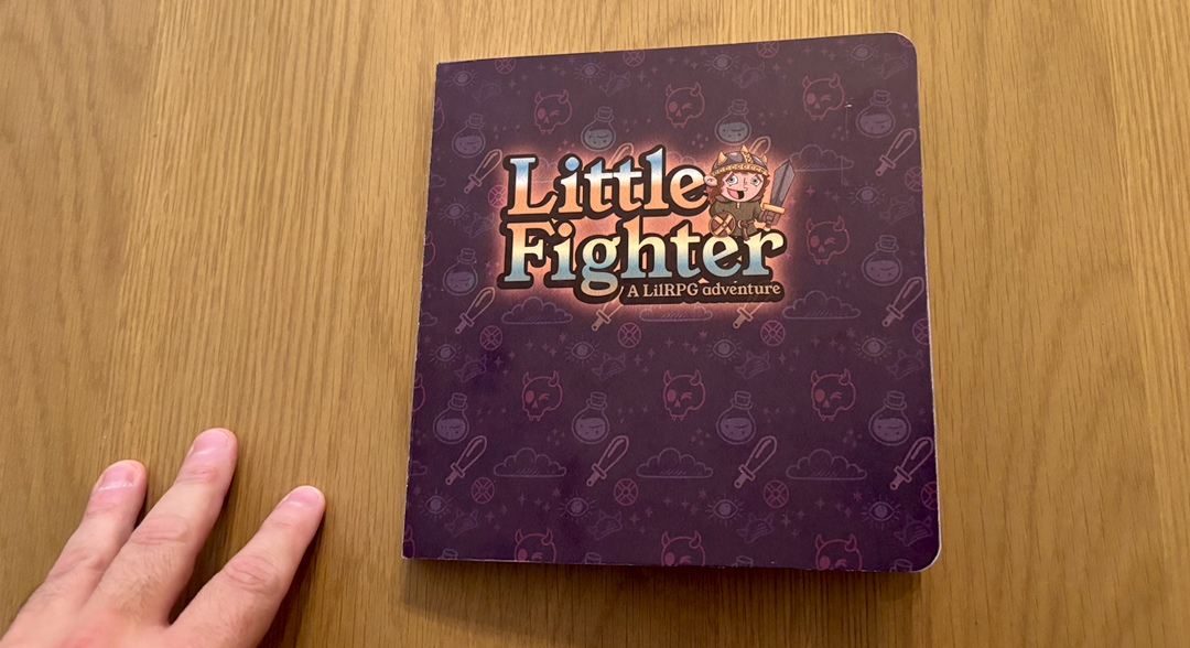
Square trim, chunky board pages, and a deep plum cover wrapped in our skull-potion-sword pattern. The title treatment came out bold and a little glowy — but this is also where we found our biggest issues, more on that below.
Title Page and Inside Cover
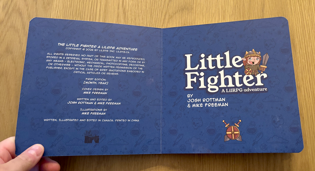
Flip it open and you get the full crew credit: written and edited by Josh Rottman and Mike Freeman, illustrations by Mike Freeman.
Two Updates Here
- We've got our ISBN now, so that'll be added to this page.
- The publication date is still pending; it'll get locked in once we send the final files to the printer.
The Bigger Note
Looking at this spread in print, the inside cover felt like a second cover. It's carrying almost as much visual weight as the actual front cover, which is too much. We're simplifying this page in the next version so it supports the book instead of competing with it.
The Story Itself
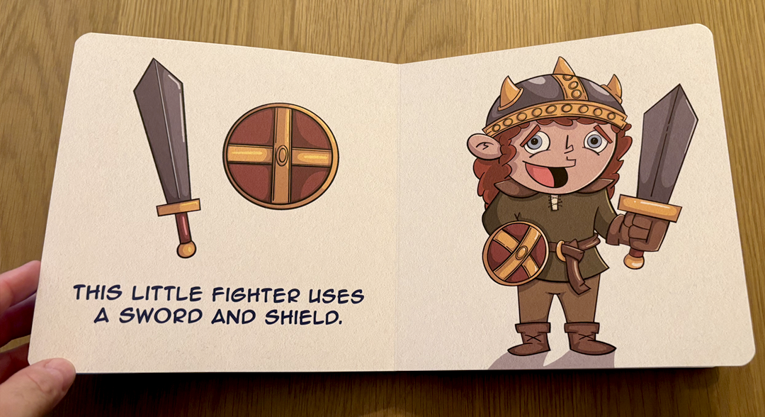
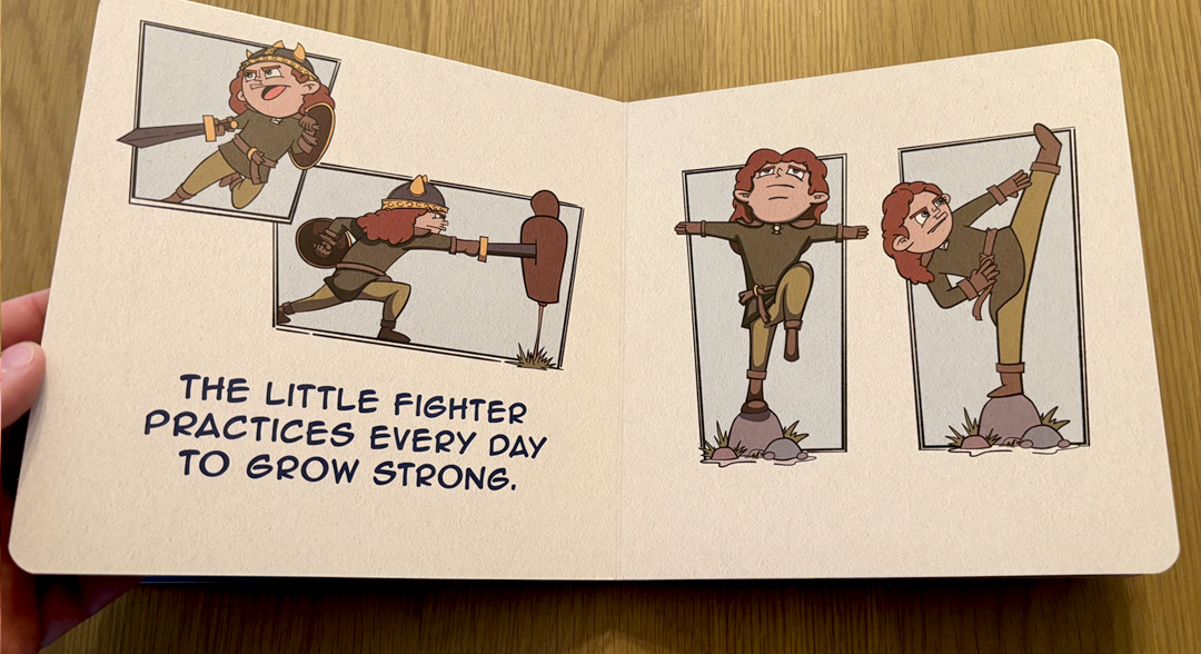
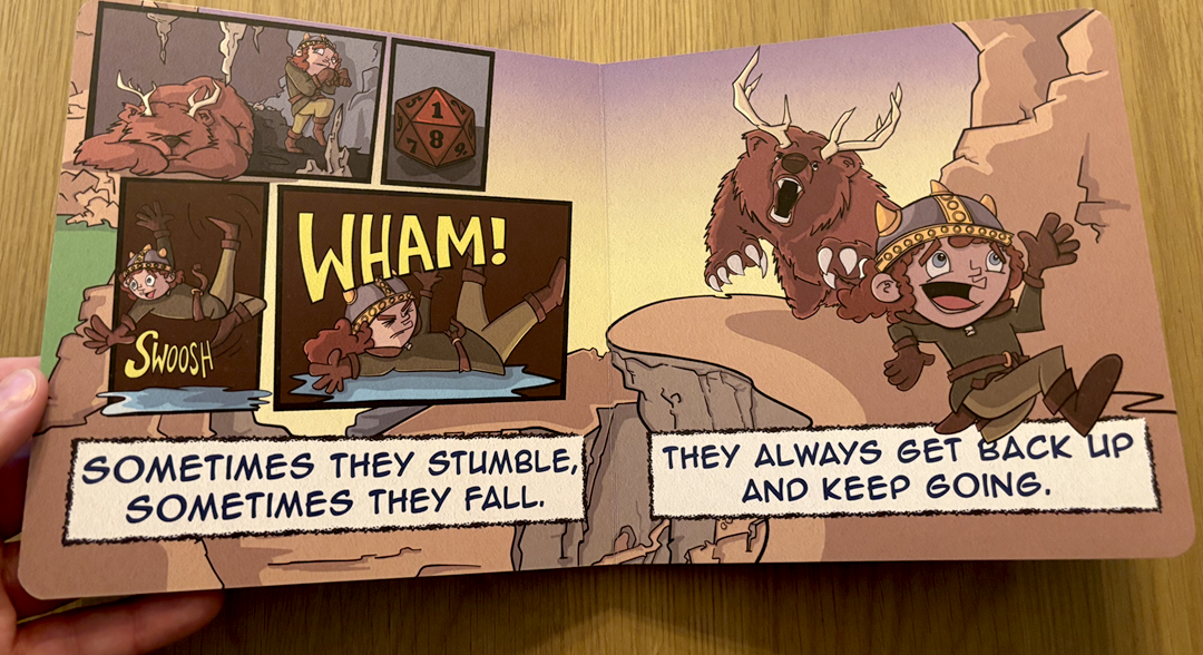
Swipe to see more →
The interior pages do what we set out to do: take classic board book patterns (opposites, routines, bedtime) and run them through a tabletop lens.
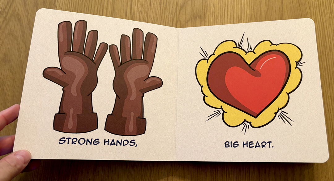
- Strong hands, big heart: pairs a set of gauntleted fists with a glowing heart, simple opposites with a fantasy skin.
- Loadout ready: a gear page spells out "this little fighter uses a sword and shield," basically a loadout screen for a toddler.
- Training montage: shows our fighter practicing, because strength is built, not given.
- Our favorite spread: a comic-panel sequence where the fighter takes a tumble against a very large, very unimpressed bear-thing, with a d20 tucked into the corner. The line reads "Sometimes they stumble, sometimes they fall. They always get back up and keep going." That's the whole book in one sentence.
- Good night, little fighter: it winds down with "the little fighter needs a long rest" (yes, that's a D&D reference, no, we're not sorry) into a "Good Night Little Fighter" close.
Overall, the story is on track. But reading it cover to cover in physical form, we felt like it's missing something. We're not ready to say exactly what yet — that's a topic for its own post soon.
Endpapers and Back Cover
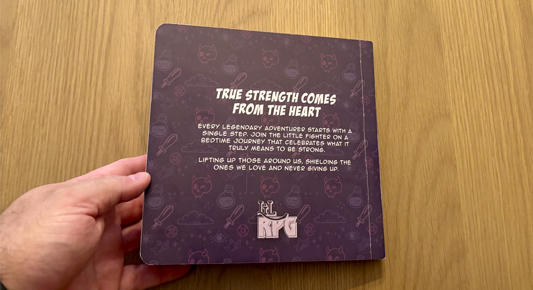
The endpapers repeat the cover pattern in a softer tone. The back cover got an upgrade too. Over the summer we built out more of the LilRPG brand, so we spruced up the back cover to reflect it. Our favorite gnome wizard now makes an appearance here, with a callout inviting readers to join the guild.
What We're Fixing
This is exactly why proofs exist. Three issues stood out immediately:
- Cover durability. The folds on the cover were already showing peeling straight out of the box. We flagged this with the printer and asked for a recommendation to improve durability. They've confirmed the final run will use child-safe varnishes and lamination throughout.
- Cover alignment and tone. The cover art on both the front and back came out off-center, and the overall color landed darker than intended. The redesigned cover will be lighter and will put more focus on introducing the Little Fighter character directly.
- Muted colors throughout. The interior colors read a bit flat compared to what we designed. Two likely causes: this proof is a digital print, not a true offset press run, and the paper-grain texture we applied to the illustrations is dulling the palette. We're likely removing that texture in the next round.
What's Next
None of this is a surprise — it's the whole point of doing a physical proof before a full print run. In the next post, we're walking through exactly what changed once we acted on these notes, plus what we think the story is still missing. More soon.
- Mike & Josh